
Buying a home isn’t just about choosing the perfect location or floor plan—it’s about creating a space where you feel comfortable, inspired, and truly at home. Every design decision, from natural lighting to furniture placement, influences how you experience your living space. Among these elements, colour plays one of the most powerful roles in shaping emotions, behaviour, and overall well-being.
Whether you’re designing your first apartment or moving into your dream home in Pune, understanding colour psychology in home design can help you create interiors that reflect your personality while enhancing comfort, productivity, and relaxation. The right colour palette doesn’t just beautify your home—it creates an environment where every room supports the way you live.
Table of Contents
ToggleWhat is Colour Psychology in Home Design?
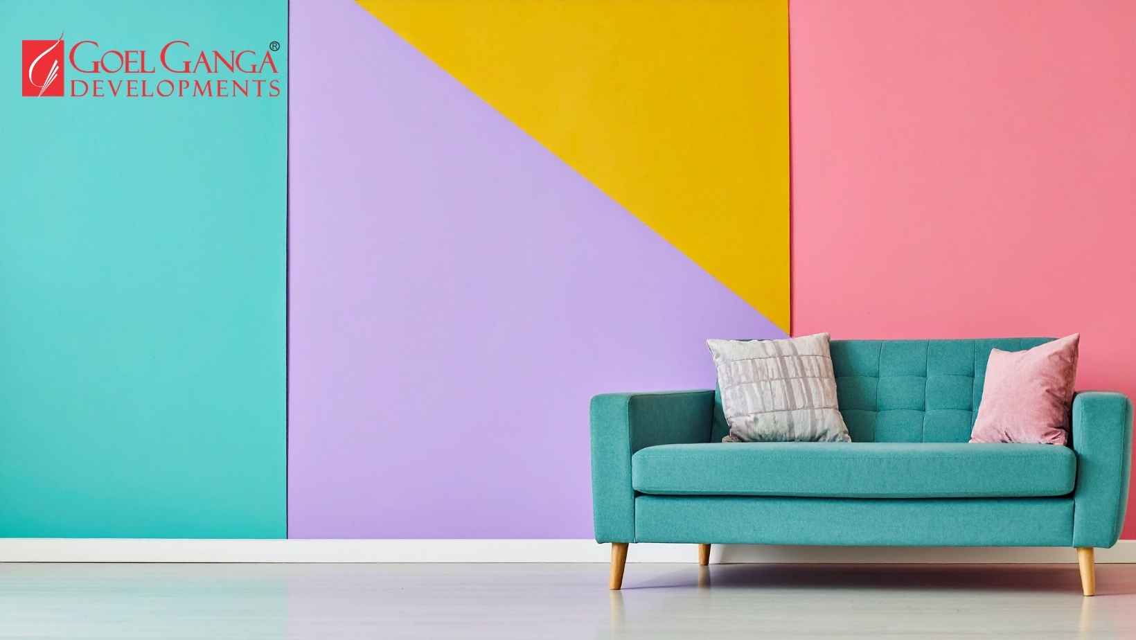
Colour psychology is the study of how different colours influence our mood, emotions, and behaviour. Interior designers have long used this principle to create spaces that evoke specific feelings—calmness, energy, creativity, focus, or warmth.
Our brains naturally respond to colours, often without us realizing it. Soft blues may lower stress levels, warm yellows can encourage optimism, while earthy greens foster a sense of balance. Choosing colours intentionally allows homeowners to create a living environment that supports their daily routines and emotional well-being.
In modern residential communities, colour psychology is also reflected in common areas, landscaped gardens, clubhouses, and wellness spaces, contributing to an enhanced living experience.
Why Colour Matters in Experiential Living
Experiential living goes beyond owning a beautiful apartment. It focuses on how every aspect of your home contributes to your quality of life—from natural ventilation and greenery to thoughtfully designed interiors that promote comfort and happiness.
Colours influence how we perceive space, interact with family members, and even how productive or relaxed we feel throughout the day. A well-designed home combines architecture, natural light, textures, and colour to create spaces that feel welcoming and functional.
For homeowners in Pune, where modern urban living meets a strong appreciation for nature and community, selecting the right colour palette can help create a home that feels both contemporary and timeless.
1. Blue: Create a Calm and Peaceful Retreat
Blue is often associated with serenity, trust, and relaxation. It is one of the most popular choices for bedrooms and reading corners because it encourages restful sleep and reduces stress.
Best suited for:
- Bedrooms
- Meditation rooms
- Study spaces
Pair blue with natural wood finishes, soft white furnishings, and indoor plants to create a tranquil atmosphere.
2. Green: Bring Nature Indoors
Green symbolizes harmony, renewal, and growth. As Pune continues to embrace sustainable living and greener neighbourhoods, green interiors naturally complement this lifestyle.
Ideal spaces include:
- Living rooms
- Balconies
- Indoor garden areas
- Home offices
Muted sage, olive, and eucalyptus greens work particularly well in contemporary homes.
3. White and Neutral Shades: Timeless Elegance
Neutral colours make spaces feel larger, brighter, and more sophisticated.
Cream, beige, ivory, warm grey, and soft white remain timeless choices because they:
- Maximise natural light
- Complement any décor style
- Create visual openness
- Allow artwork and furniture to stand out
They are especially suitable for apartments where maximizing brightness is important.
4. Yellow: Add Warmth and Optimism
Yellow is associated with happiness, positivity, and creativity.
Used thoughtfully, it can brighten spaces such as:
- Dining rooms
- Breakfast corners
- Children’s rooms
- Entry foyers
Rather than painting entire rooms bright yellow, many designers recommend using softer shades or accent walls to maintain visual balance.
5. Earthy Browns and Terracotta: Comfort Meets Sophistication
Inspired by natural materials like clay, wood, and stone, earthy tones create warmth and a strong connection with nature.
These colours pair beautifully with:
- Wooden furniture
- Indoor plants
- Natural textures
- Handcrafted décor
They are increasingly popular among homeowners seeking biophilic interior design.
6. Grey: Modern Yet Versatile
Grey has become a favourite in contemporary homes because of its versatility.
Lighter greys create an elegant backdrop, while charcoal accents introduce depth and sophistication.
Combine grey with:
- White
- Wood textures
- Metallic finishes
- Soft furnishings
to prevent interiors from feeling cold.
7. Pink and Peach: Gentle Warmth
Soft blush, peach, and dusty pink tones create welcoming environments without overwhelming the senses.
These shades work beautifully in:
- Guest bedrooms
- Children’s rooms
- Dressing areas
- Reading nooks
When combined with neutral colours, they create a balanced and modern aesthetic.
8. Accent Colours for Personality
Not every wall needs bold colours.
Accent colours can be introduced through:
- Artwork
- Cushions
- Curtains
- Rugs
- Statement furniture
- Decorative lighting
This approach allows homeowners to refresh interiors without major renovations.
Factors Beyond Colour
While colour is important, it works best when combined with other design elements.
Natural Light
Homes with large windows and abundant daylight enhance the appearance of every colour, making interiors feel brighter and more inviting.
Ventilation
Well-ventilated homes improve indoor comfort and allow colours to appear fresher throughout the day.
Green Spaces
Views of landscaped gardens and open spaces naturally complement earthy and neutral interior palettes.
Smart Layouts
Open layouts create better visual flow, allowing colours to connect different living areas seamlessly.
Choosing Colours Based on Your Lifestyle
Different families have different needs.
Young Professionals
Choose calming blues, greys, and greens that support work-life balance.
Families with Children
Introduce cheerful yellows, warm neutrals, and playful accent colours to create lively yet comfortable spaces.
Senior Citizens
Soft pastel shades, warm whites, and muted greens create peaceful environments that promote relaxation.
Work-from-Home Professionals
Use calming greens or muted blues in your workspace to improve focus while reducing visual fatigue.
Why Thoughtful Home Design Matters
A thoughtfully designed home influences much more than aesthetics. It shapes daily routines, strengthens family connections, supports wellness, and creates lasting memories.
Modern homebuyers increasingly seek residences that combine:
- Functional layouts
- Natural light
- Sustainable design
- Green open spaces
- Wellness amenities
- Beautiful interiors
Together, these elements create an experience rather than simply a place to live.
Experiential Living in Pune
Pune has evolved into one of India’s most desirable residential destinations because of its blend of educational institutions, employment opportunities, green neighbourhoods, and modern infrastructure.
Today’s homebuyers are looking beyond square footage. They seek homes that support their aspirations, encourage meaningful experiences, and enhance everyday living.
From landscaped gardens and wellness amenities to thoughtfully designed apartments filled with natural light, experiential living is redefining residential communities across Pune.
Frequently Asked Questions
What is colour psychology in interior design?
Colour psychology studies how different colours influence emotions, mood, and behaviour within living spaces.
Which colour is best for a living room?
Neutral shades, earthy greens, and warm beige tones create welcoming and versatile living spaces.
Which colours make a room look bigger?
White, cream, beige, and light grey reflect more light, making rooms appear larger and brighter.
How do colours affect mental well-being?
Calming colours like blue and green can reduce stress, while warm colours such as yellow promote positivity and energy when used appropriately.
Why is colour important in experiential living?
Colours enhance the emotional connection between people and their homes, supporting comfort, relaxation, creativity, and overall well-being.
Final Thoughts
Your home should do more than provide shelter—it should inspire, comfort, and enrich your everyday life. Thoughtfully chosen colours, combined with intelligent architecture, natural light, and sustainable design, create spaces where every moment feels meaningful.
As experiential living continues to shape modern residential developments in Pune, designing interiors with colour psychology in mind allows homeowners to create environments that truly reflect their lifestyle and aspirations. Whether you’re planning your first home or your forever home, choosing colours with intention is a simple yet powerful way to make every space feel just right.